
NYC Broker App
UX/UI
The ask was to create a craigslist app that made the apartment hunting process easier for realtors/brokers. The end result was an app that was an all in one communication tool that improved the efficiency of their work day.
Research Summary
Brokers often get a bad rep. Especially in NYC. Research is one of the most enlightening parts of the product design process, besides testing , and as someone who isn't originally from NYC, the very idea of a broker to me seemed unecessary. It wasn't until I did research into exactly what it takes to become a broker, what they do besides showing apartments, and how hard and competitive of a job it is, that I gained an understanding that would help me design something that would make their lives alot easier.
Brokers often get a bad rep. Especially in NYC. Research is one of the most enlightening parts of the product design process, besides testing , and as someone who isn't originally from NYC, the very idea of a broker to me seemed unecessary. It wasn't until I did research into exactly what it takes to become a broker, what they do besides showing apartments, and how hard and competitive of a job it is, that I gained an understanding that would help me design something that would make their lives alot easier.
Pain Points
- Brokers are working on deals for many apartments at once. It can be hard to keep track of which client is interested in which apartment.
- Brokers often get stood up by clients for apartment showings, wasting the broker's time
- Between showing apartments and creating new listings, days can be very long
- Time management
Goal
Create a more efficient way to communicate with clients and make ads for listings while still giving quality service without the long hours.
Create a more efficient way to communicate with clients and make ads for listings while still giving quality service without the long hours.
Persona
I created multiple personas, including one that is a more well-known, seasoned broker, guaranteed to secure clients based on name and reputation, but I focused on our young broker, whose lifestyle depends on the commision she makes from getting clients into the perfect space.
I created multiple personas, including one that is a more well-known, seasoned broker, guaranteed to secure clients based on name and reputation, but I focused on our young broker, whose lifestyle depends on the commision she makes from getting clients into the perfect space.

Design
I focused on a few key features that I thought had the most impact and were most directly related to the original goal.
I focused on a few key features that I thought had the most impact and were most directly related to the original goal.

Straightforward Listings
Users can see the broker’s fee on the listing page so they know this information before contacting the broker for a viewing. Listing it along with the price gives the idea that the brokers fee is non-negociable. This way the broker and hunter are on the same page, and brokers wont have to haggle over the money they live off of.

Arranged By Unit
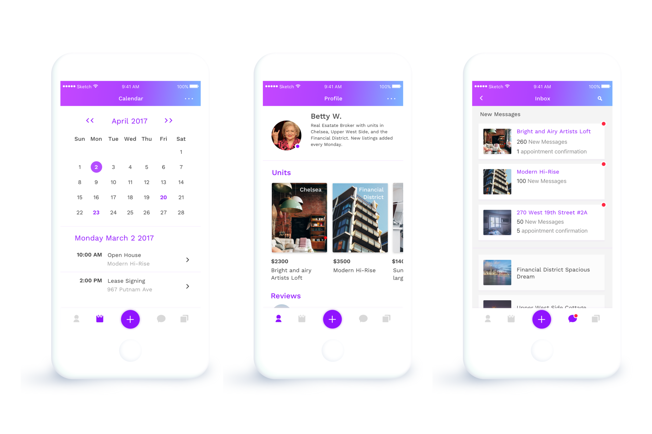
Unread messages and new appointments are surfaced to the top, allowing the broker to better manage multiple conversations without mixups. .

Consistent Listings
With the listing feature, the broker is guided in how to create a new listing, including which pictures to take.
Broker Profile
The broker profile page was designed to empart trust, credibility, accountability, and transparency as well as to be a central hub to showcase listings, reviews, open-houses, and contact information.

Redesigned Inbox
Instead of an endless page of messages from individuals, the inbox is arranged by unit, making communicating easier and more efficient.

Events Calendar
Open houses, lease signings, showings, and other meetings all appear on the broker calender.
